Typography in 2026 is undergoing a major shift. Serifs return, imperfection becomes a strategy, and type regains character, craft, and joy. Discover five trends reshaping the visual landscape.
Visual Rebellion: Why Typography in 2026 Rediscovers Character, Craft, and Joy
Typography in 2026 stands at the edge of a profound transformation. For years, sterile sans serifs and corporate minimalism dominated. Now, the design world is turning toward an aesthetic that embraces emotion, texture, imperfection, and joy. It’s a return to humanity — and a rebellion against the visual uniformity of the digital age.
Designers everywhere are rediscovering that typography is not merely a technical tool. It carries story, atmosphere, identity, and often values. That’s why typography has become one of the most expressive arenas of today’s visual rebellion.
This essay explores five key trends shaping the typographic landscape of 2026. All point to the same truth: character is back. Craft is returning, and joy is now a legitimate design strategy, highlighting the significance of typography in 2026.


1. Typography as Storyteller
Not long ago, typography was expected to stay in the background. It had to be “invisible,” functional, unobtrusive. But in an era of content overload and shrinking attention spans, type has become an active narrator.
In 2026, typography moves from decoration to storytelling. It doesn’t just convey information — it creates atmosphere, rhythm, and emotion.
Designers use:
- dynamic size shifts,
- color accents,
- freer compositions
to give text breath and personality.
This trend marks a liberation from years of “playing it safe.” What audiences crave now is not perfection but authenticity.
2. The Big Return of Serifs
Serifs were long dismissed as old-fashioned or overly editorial. Today, those very qualities make them invaluable.
In a digital world filled with smooth, artificial, interchangeable surfaces, serifs offer refuge. They bring:
- texture,
- nuance,
- history,
- craftsmanship,
- trust.
Their comeback isn’t nostalgic — it’s necessary. People are tired of visual sterility, and serifs give exactly what’s missing: a human touch, blending it perfectly with the emerging trends in typography from 2026.
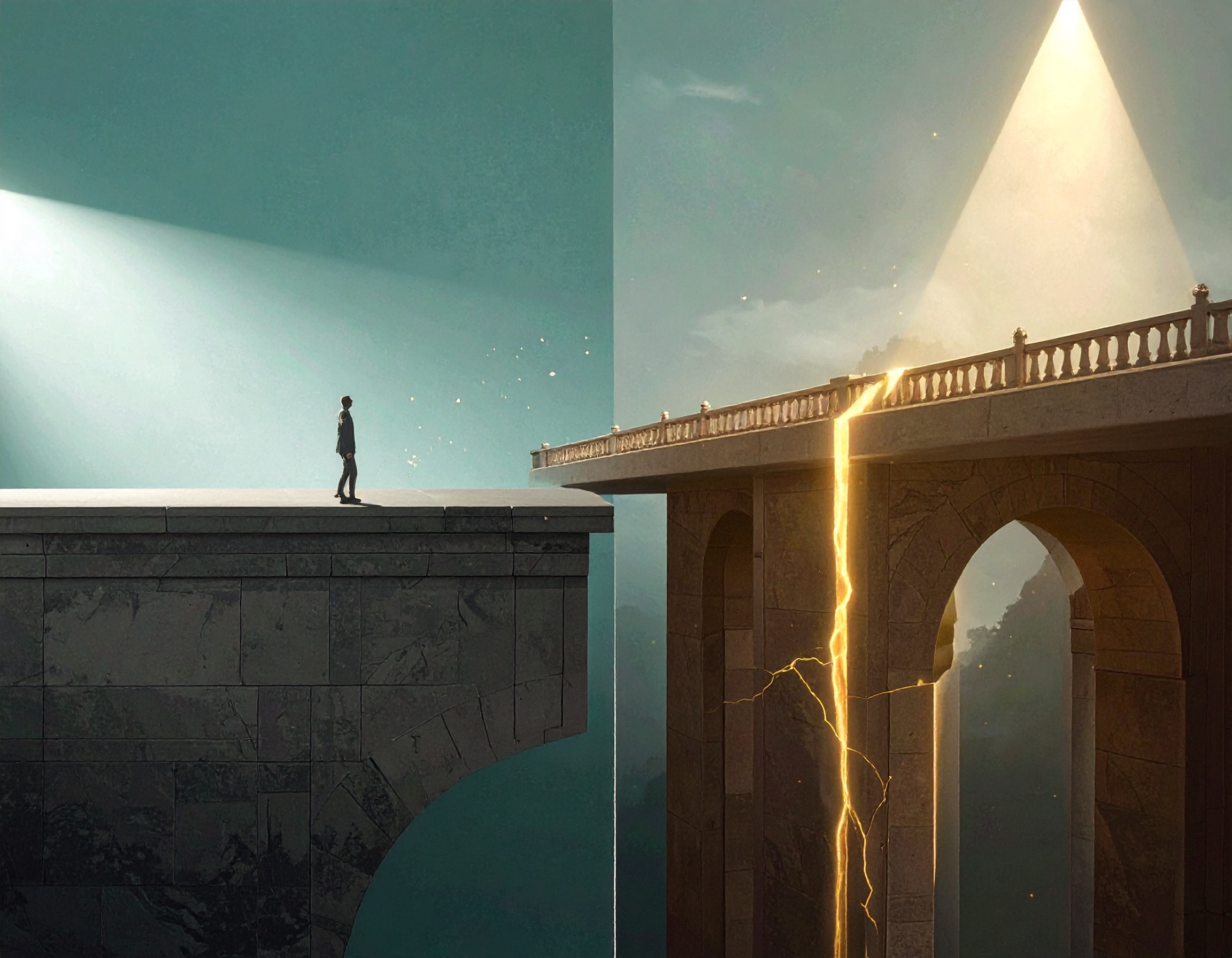
3. Hacked Tradition: When the Past Gets a Glitch
One of the most exciting trends of 2026 is the deliberate distortion, shifting, or “mutation” of historical forms.
It’s typographic upcycling:
Take something familiar, break it apart, reinterpret it, and return it to the world with new energy.
This approach blends:
- nostalgia,
- digital experimentation,
- hand-made imperfection,
- rebellious spirit.
The resulting typefaces feel both familiar and unsettling. Small asymmetries, glitch effects, broken rhythms — all ways of reintroducing human presence into digital design. This marks the creativity and uniqueness of typography styles seen in 2026.


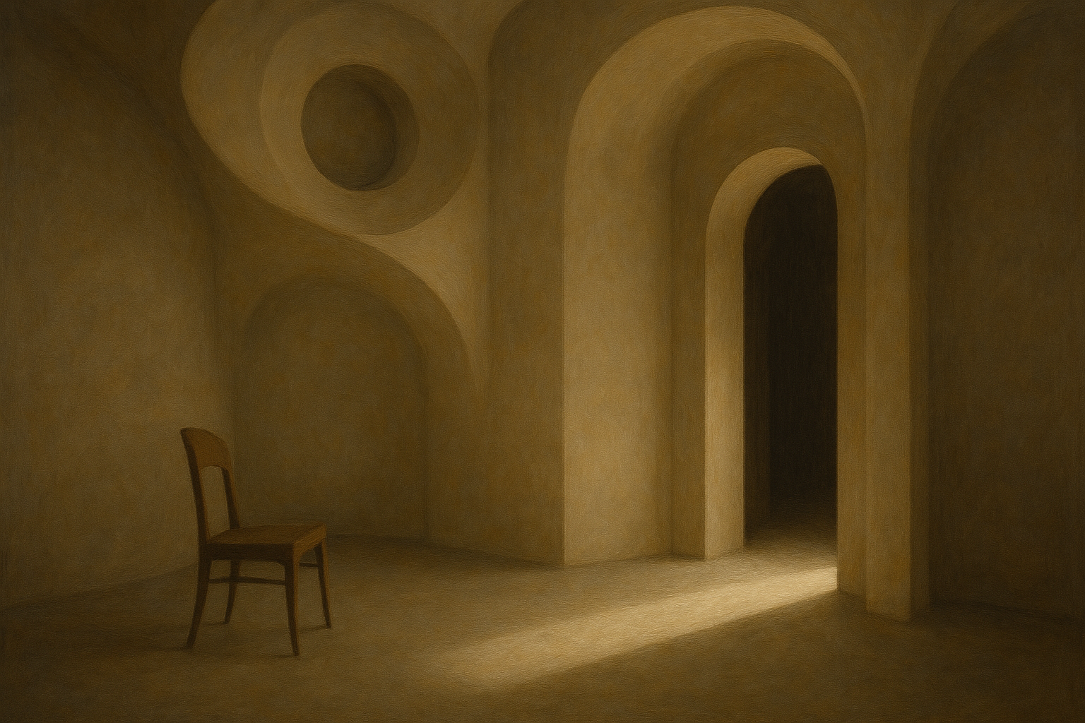
4. Intentional Friction: The Power of Imperfection
In an age when AI produces flawless visuals in seconds, designers are making a shift. They are turning toward aesthetics that feel rough, textured, and imperfect.
This isn’t a mistake — it’s a strategy.
This trend embraces:
- grain,
- noise,
- broken outlines,
- irregular contours,
- hand-drawn qualities.
It’s a rebellion against technological smoothness.
A message: A human made this.
Imperfection becomes a new form of honesty, is essential to typography in 2026.
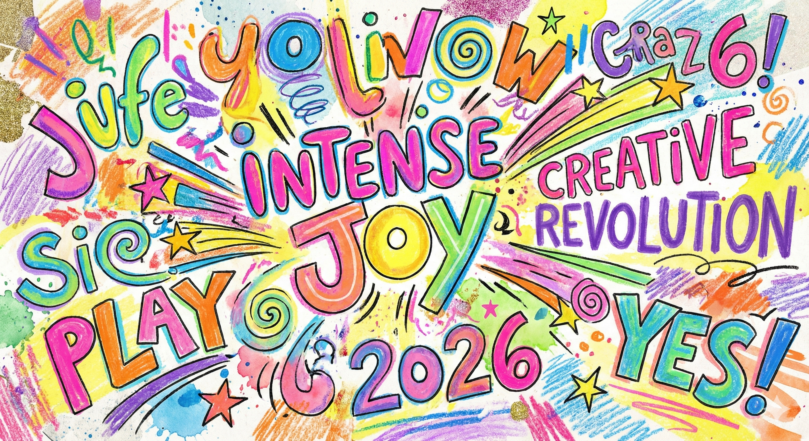
5. Intense Joy: Typography That Smiles
The most refreshing trend is the return of joy.
After years of corporate minimalism and fear of standing out, 2026 welcomes bold, colorful, energetic typography.
Joyful type is:
- expressive,
- emotional,
- colorful,
- theatrical,
- unapologetically alive.
It’s not just an aesthetic — it’s a psychological need. Designers are remembering that the visual world can be not only functional but also delightful. This highlights the joyful nature of typography in 2026.
Conclusion: Typography as a Compass of Authenticity
2026 is a year of typographic humanity.
A year that brings back character, history, texture, and emotion.
A year that pushes back against uniformity.
The return of serifs, hacked tradition, intentional friction, and joyful expression all point to one question:
How does the personality of the letters we read shape our sense of what feels real?
Typography is no longer just a tool — it’s a declaration of identity, especially evident in the developments for typography in 2026.

Leave a Reply